Mixing the High Street: A Handmade Palette of Brick, Brew and Bus-Stop Grey
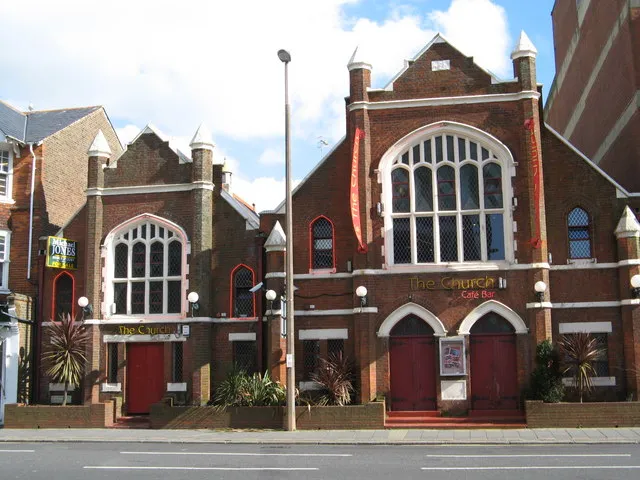
Photo: Josie Campbell , CC BY-SA 2.0, via Wikimedia Commons
Most digital palettes arrive ready-made. You open a file, choose from a neat row of swatches, and suddenly your illustration looks like everyone else's illustration. I have nothing against digital colour, but I do think a palette should feel borrowed from somewhere real. For me, that somewhere is the high street: the brick, the tea, the tarmac, the moss, the vinegar.
This is a process I have been refining in my sketchbook through 2026. It starts on foot, with a small paint kit and a willingness to look slightly odd while staring at a wall. It ends with a set of hand-mixed swatches that behave like a place rather than a brand.
Why default palettes feel borrowed
Default palettes are designed to be safe. They are balanced, accessible and endlessly repeatable. That is useful for a client deck. It is less useful for a drawing that wants to smell of wet pavement and chips. When every illustration uses the same six cheerful colours, the image loses its local accent. It could be anywhere. It could be nowhere.
A handmade palette does the opposite. It carries the specific dirt of a place. Terrace brick is not one red. It is orange, brown, soot and a bit of cheap paint. Bus-stop grey is not a flat neutral. It is blue-ish in the rain and green-ish under a tree. Those shifts are the interesting part.
A colour walk, not a colour hunt
I do not go out looking for perfect colour matches. I go out with a small watercolour tin, a few strips of watercolour paper and a pencil. When something catches my eye, I stop and make a quick swatch on site. Not a finished painting. Just a patch of colour, a pencil note and the date.
I write down the place and the weather. Outside the launderette, drizzle, 3pm. Moss on the wall by the bus stop, cold and bright. Tea in a chipped mug, second brew. These notes matter as much as the colour. They stop the palette from becoming abstract.
If you use your phone, use it for reference, not for stealing. Photograph the wall, the bin, the puddle. Then mix the colour by eye when you get home. The tiny error is where the hand comes in. That error is usually the best bit.
Field notes from five ordinary things
Terrace brick
Start with burnt sienna, a little cadmium red and a touch of Payne's grey. Mix them on the page rather than in a perfect puddle. You want variation: a warm brick for the sunlit end of the terrace, a cooler brick for the shadow under the bay window. If it gets too pink, add yellow ochre. If it gets too orange, add a speck of blue.
In the sketchbook, I use three brick notes per drawing: a base, a shadow and a sooty edge. The eye fills in the rest. A street of identical bricks looks like wallpaper. A street of three related reds looks like a place.
Stewed tea
This is the colour of a mug left too long on the desk. Yellow ochre, burnt umber and a tiny amount of white. For a stronger brew, add a little permanent rose. For a milky tea, more white and a cooler grey. I use stewed tea for skin shadows, old paper, window frames and the inside of a cafe. It is a quiet workhorse colour.
Bus-stop grey
Payne's grey plus a little yellow ochre and white. That gives you a grey with a greenish warmth, like a painted metal panel that has seen weather. For the rainy version, add a touch of indigo. For the sunny version, add more white and a speck of raw sienna. I keep two bus-stop greys on the palette: one for metal, one for wet pavement.
Mossy wall
Sap green, yellow ochre and a little of the bus-stop grey. Mix it unevenly. Moss is not a flat green; it is a series of damp patches. I like to stipple it with a dry brush and then add a few darker dots with a pencil. On a brick wall, let some of the brick colour show through. Moss grows in the gaps, not over the whole story.
Chip-shop vinegar
This is the strangest and most useful colour. It is not really green, not really yellow, not really grey. Start with a very pale green-gold, lots of water, a touch of yellow ochre and the faintest hint of blue. Use it for glass, steam, wet wrappers and the shine on a paper bag. It is the colour of something translucent and slightly acidic.
I also keep a tarmac note: indigo, burnt umber and white. Not black. Black kills the surface. A blue-brown grey keeps the road looking wet and alive.
Mixing by hand: a few practical notes
Use small amounts. It is much easier to add a speck of blue than to rescue a puddle that has gone too far. Keep a scrap of paper beside you for testing. Label every swatch with the mix and the place. I use a tiny pencil note underneath: brick, damp, Tuesday. It sounds fussy, but it turns the palette into a record.
Do not aim for exact matches. Aim for family resemblance. The brick on your page does not need to be the brick outside the window. It needs to sit next to the tea and the grey in a way that feels believable. That is a relationship, not a recipe.
From swatch to drawing
When I start an illustration, I choose five or six swatches from the sketchbook and stick to them. A typical high street spread might use terrace brick, stewed tea, bus-stop grey, moss and vinegar, with tarmac as the anchor. That limited set forces the drawing to hold together. It also stops me from adding a random bright blue just because it looks nice on screen.
I paint the shapes first, then draw back into them with pencil. The pencil line sits on top of the colour like a note in the margin. That is the handcrafted feel I want: visible decisions, slight wobbles, colour that looks mixed rather than selected.
Keeping the palette alive
A palette is not a finished thing. It changes with the season and the street. In winter, the brick gets darker and the tea gets stronger. In summer, the moss dries out and the vinegar goes pale. I add a new swatch whenever something catches my eye, and I retire the ones that stop feeling true.
The point is not to build the definitive British palette. The point is to build your own, one wall and one mug at a time. It will be specific, slightly awkward and much more interesting than a downloaded set of perfect little squares.