Painted, Peeling, Perfect: Sketching the Signs of a British High Street
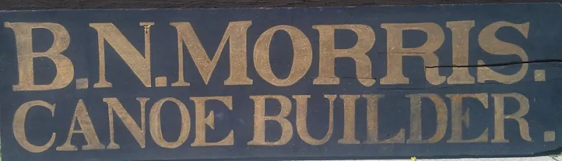
Photo: Kathrynklos, CC BY-SA 4.0, via Wikimedia Commons
There is a particular kind of quiet drama in a high street sign that has done its job for twenty years. The paint has thinned where hands push the door. The gold leaf has gone a little green at the edge. A chalkboard leans against the wall with today's soup in three colours of chalk. These are not grand subjects. That's exactly why they work in a sketchbook.
This isn't about mourning a lost golden age of shopfronts. It's about looking properly at what is still there in 2026: the hand-painted fascia, the vinyl window decal, the A-board that gets rewritten every morning. They are drawings with a job to do, and they reward a slow pencil.
Start with the lettering, not the shop
Signwriting is drawing with a deadline. Look at how the letters sit on the fascia before you look at the shop itself. Is the spacing tight or generous? Does the signwriter use a thick downstroke and a thin upstroke, or a monoline that keeps everything even? Are there shadow blocks, an outline, a painted ampersand that curls like a comma?
A long shop name squeezed into a narrow board is often more interesting than a tidy one. The letters get narrower, the spacing gets nervous, the apostrophe becomes a tiny afterthought. Draw those compromises. They are the human evidence.
When I sketch a sign, I block in the lettering with pencil first — just rectangles and centre lines — then commit to ink once the spacing feels right. If the lettering is wonky, I keep it wonky. Straightening it out turns a portrait into a diagram.
Wear is the story, but don't fake it
Chipped paint, rust blooms, faded vinyl and a rectangle of brighter paint where a sticker used to be: these are the details that make a shopfront feel lived in. But there's a temptation to overdo wear, to turn every sign into a romantic ruin. Resist it. Draw what is actually there.
Look for the specific places where a sign has failed. The bottom edge of a door, where shoes have kicked it. The corner where a delivery van clipped the fascia. The window lettering that has bubbled in the sun. A single accurate scuff is worth more than a dozen decorative cracks.
Colour under British light
British high street colour is rarely clean. A greengrocer's green might be closer to olive in the shade of a November afternoon. A chip-shop red can look almost brown under a grey sky. Pharmacy blue, butcher's tile, the particular orange of a discount shop's price bursts — these are local colours, not brand colours.
I like to note colour in words first: 'faded mint', 'rusty pillar-box red', 'chalkboard grey with a blue edge'. Then I paint later, away from the street, when I'm not trying to match a memory. The aim is not a perfect colour chart. It's the colour the sign leaves in your head.
A workable route for a busy street
Sketching on a high street is a bit like drawing in a library: you need to be still, small and polite. Find a spot out of the flow of foot traffic — against a wall, beside a bin, under a shop awning. Work at A5 or smaller. A tiny sketchbook draws less attention than a broadsheet pad.
Start with one detail rather than the whole shop. A door handle, a house number, the top curve of a painted 'S'. Once that's down, build outwards. If you're going to be there a while, ask the shopkeeper first. Most people are pleased to be asked, and some will tell you exactly when the sign was last repainted.
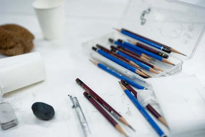
Use pencil for structure and a fineliner for the lettering, then add colour at home. If someone stops to ask what you're doing, show them the page. It takes ten seconds and usually ends with a story about the shop's previous owner.
What shopkeepers know
Ask about the sign and you often get a small history of the street. Who painted it. When it was last touched up. Why the lettering leans to the left. One shopkeeper might tell you the signwriter did it in a single afternoon and never came back; another might say the chalkboard is the only bit they still do themselves.
These conversations don't need to go in the drawing, but they change how you see it. A fascia stops being a flat graphic and becomes a piece of local knowledge. That's the handcrafted part: not the nostalgia, but the attention.
A small sketchbook exercise
Choose one short stretch of high street and draw three signs in three 6cm boxes: a painted fascia, a chalkboard, and a window decal. Give each one ten minutes. Don't draw the whole building. Just the sign, the wear and the colour notes.
When you get home, write one line under each sketch: what the sign is doing, and what it tells you about the shop. That's the beginning of a visual story — not a heritage postcard, just a street seen properly.